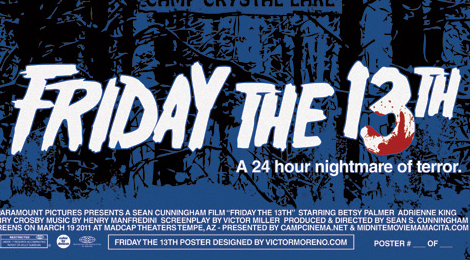
Friday the 13th 1980 Poster Created For MadCap Showing
Last weekend, a very special showing of Friday the 13th 1980 was presented to fans in Tempe, Arizona. MadCap Theatres in Tempe held two showings of the film last Saturday, March 19th and commissioned a design firm to create two unique and brand new posters for the event.
Victor Moreno Designs created one design for the poster but offered two different colored tints for the 80's slasher. Check out the posters below. A hockey mask was included in the artwork, which some may sour on, but the inclusion of the woods, moon and old style Camp Crystal Lake sign will suit the old school fans.
If you are interested in purchasing one of these prints make sure to check out http://www.victormoreno.com/! What do you think of these renditions for the film?


These seem kind of generic, if you ask me. I can think of a couple of people I know that could create this poster.
ReplyDeleteI like the poster, but not for the occassion. I mean, they're showing the original Friday the 13th, that Jason wasn't even in save for one sequence at the end, and they're showing the mask, which didn't come in until part 3. I think they needed to do something more reflective of the original Friday than the series as a hole.
ReplyDeleteI have to agree with the below comments. A hockey mask on the original poster is kind of a dumb idea. And the CCL sign reminds me of the sign Sandra finds in part 2.
ReplyDelete