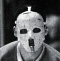
Is This The Future of Jason's Mask?
DISCLAIMER: I realize that this is a touchy subject. As a fan, I like to think outside of the coffin and contemplate the realms of creativity. Now then....
The evolution and historical cinematic significance of Jason’s hockey mask has been researched, documented, discussed, and debated ever since the late Richard Brooker stepped onto that dock at Higgins Haven and delivered a cupid’s arrow into poor Vera’s eye socket. The mask transcends merely being iconic. It is recognizable to movie fans all over the globe. As a fan and amateur mask painter myself, I’ve often wondered “Where do we go from here?”.
The evolution and historical cinematic significance of Jason’s hockey mask has been researched, documented, discussed, and debated ever since the late Richard Brooker stepped onto that dock at Higgins Haven and delivered a cupid’s arrow into poor Vera’s eye socket. The mask transcends merely being iconic. It is recognizable to movie fans all over the globe. As a fan and amateur mask painter myself, I’ve often wondered “Where do we go from here?”.
I’ve discussed this topic with acclaimed artist and Friday the 13th expert, Crash Cunningham (www.crashcreations.com). We both agreed that through the decades, the mask evolved in style from a traditional “hockey mask” to more of a “Jason mask”. Raging debates ignite within internet chat rooms about which masks are more frightening and which have been the most effective in hiding Mr. Voorhees' deformed face from view.
I had the opportunity to take a peek at a recent script for a 1980’s version of the 13th film that sadly, won’t go into production. In the script, the writer describes the mask as such…
“This isn’t a modern goalie mask. IT’S FROM THE ‘60S, THE EARLY DAYS OF GOALIE MASKS, SIMPLE AND MINIMALIST. Stark white. Just black eye holes and few small ones at the mouth.”
I found this wonderfully interesting. As such, Google became my friend....
Of course, this is a departure from the yellowed hockey masks we have been accustomed to over the years. Most notably absent in this treatment are the red (or blue, you crazy Roy fans) triangles from the cheeks and forehead. While the skull-like depiction of the mask comes from the author’s pen; a director, producer, or effects team certainly could have their say as well. Still, the concept of a change in mask style is intriguing. It certainly harkens back to the roots of the vintage goalie masks popularized by Jacques Plante that served as the inspiration to the mask Shelly Finkelstein fancied in part 3.

 | |
| (Dating 101: Don't be an asshole.) |
In the Halloween series of movies directed by Rob Zombie, RZ recreated a faithful reproduction of the Michael Myers mask for part one. In his sequel, the mask exhibited signs of deterioration and damage resulting in a mask that barely covered the actor’s face. Fan backlash for this treatment of The Shape was enormous.
The television adaptation of the Scream franchise also featured a redesign of the Ghostface mask. Fueled in part by the fear factor of the original mask being diluted by the Scary Movie franchise, the updated mask allowed a more rich back story to emerge.


